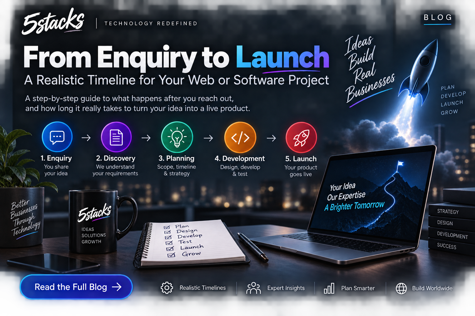
From Enquiry to Launch: A Realistic Timeline for Web and Software Projects
“How long will it take?” depends on scope and decisions. Visual timelines for In...

Buyers decide if you look safe in seconds. They may not say “the typography is inconsistent.” They feel unease — and leave. Trust is not a logo animation. It is hierarchy, clarity, proof, and craft working together.
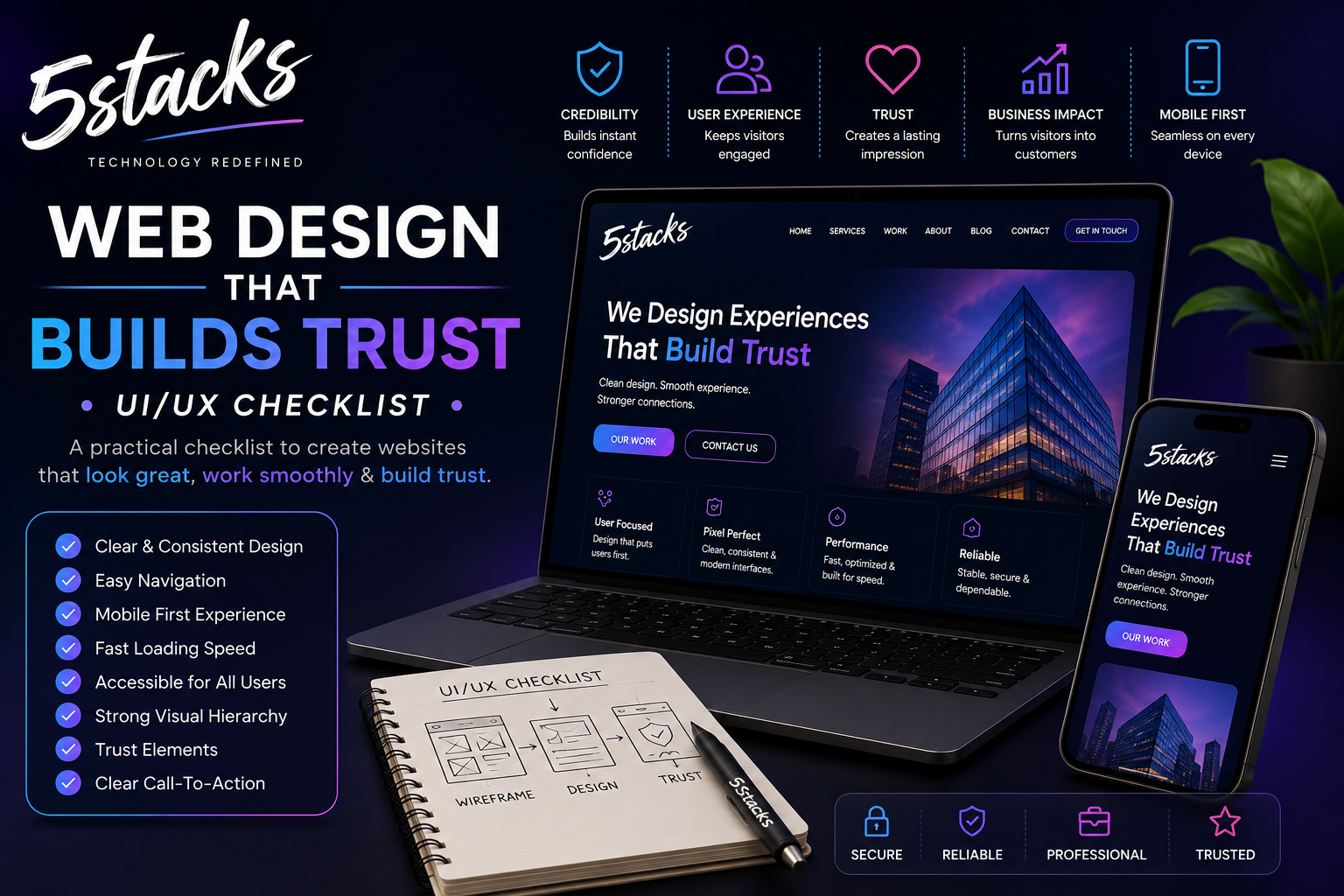
Use this checklist when you evaluate your site or brief a web design project. It is written for Indian SMB and B2B brands that need credibility more than trend-chasing.
Marketing claims (“trusted partner”) cannot compensate for cluttered layouts, stock-photo theatre, or broken mobile menus. Design either supports the claim or contradicts it.
Trust-building design answers silently:
Visual idea: Two first-viewport mockups — cluttered template vs calm hierarchy with brand, headline, proof, CTA.
| Element | Trust-building approach | Trust-eroding approach |
|---|---|---|
| Hero | Brand + one promise + one CTA | Everything competing at once |
| Sections | One job per section | Mixed CTAs, cards, and banners |
| Spacing | Breathing room, clear groups | Dense walls of text and icons |
| Imagery | Real product/work/context | Generic handshake stock photos |
On branded pages, the brand should be a hero-level signal — not only a tiny nav mark. If you remove the logo and the page could belong to anyone, branding is too weak.
Link proof to real work in your portfolio. Empty logo walls and fake counters damage trust.
Pick a clear visual direction and stick to it. Expressive type helps; random font stacks and rainbow accents do not.
Match design to brand personality: industrial firms need different energy than consumer D2C — but both need calm hierarchy.
Trust breaks in the details:
Microcopy is UX. “Submit” is weaker than “Send message” or “Request a callback.”
Accessibility is trust and reach:
You do not need perfection on day one. You need not to exclude customers accidentally.
Fail three or more and redesign priorities should start with messaging and hierarchy — not another illustration pack.
| Page | Trust job | Quick test |
|---|---|---|
| Home | Credible first impression | 5-second offer test |
| Services | Depth + qualification | FAQs match sales objections |
| Portfolio | Proof | Outcomes visible without click |
| About | Human presence | Real team or leadership context |
| Contact | Low friction | Works on mobile one-handed |
Review on mobile first. Open Home, top service, Contact. Ask: offer clear in 5 seconds? proof within one scroll? CTA obvious? forms short? brand consistent with LinkedIn? Note failures before debating colours.
Limit button styles, heading levels, and card patterns. Inconsistency reads as amateur — especially on B2B sites where buyers compare three vendors side by side.
Design files should specify spacing, states (hover/error/disabled), and real content — not lorem ipsum heroes. Developers should not guess trust-critical details.
Trust improves with real photography, updated case studies, and fixing broken links. Schedule quarterly UX sweeps, not only annual rebrands.
Most Indian B2B evaluation happens on mobile. Check: sticky header does not hide CTAs; phone numbers are tap-to-call; forms do not zoom awkwardly on focus; images are not cropped into nonsense; menu opens reliably. A desktop-perfect site that fails on mobile fails trust.
Before: Hero with vague headline, stock photo, three competing CTAs, no proof above fold.
After: Brand + specific outcome headline, one CTA, case study snippet or client context, calm spacing.
Before: Service page that is one long paragraph.
After: Scannable sections, table of deliverables, FAQs, contact block.
Small trust fixes compound. You do not always need a full rebrand — you need intentional hierarchy on the pages that sell.
Pair design with development and SEO so the trusted look is also findable and fast. Explore web design services or book a design review with 5Stacks.
Do we need a full redesign?
Dark mode or light?
How many fonts?
Can good design fix a weak offer?
Should we use a UI kit / template?
How important is motion?
What should we prepare before a design project?