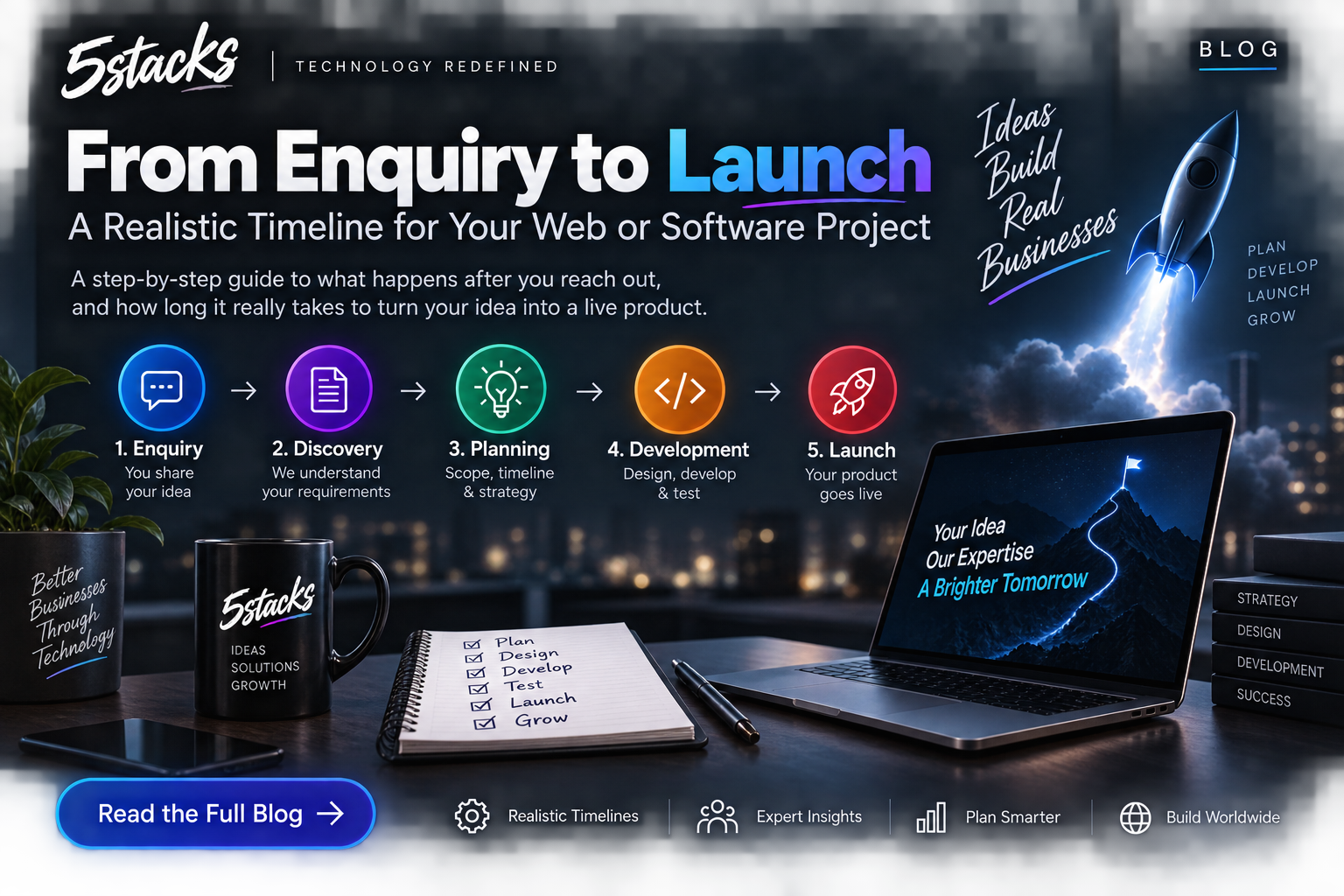
From Enquiry to Launch: A Realistic Timeline for Web and Software Projects
“How long will it take?” depends on scope and decisions. Visual timelines for In...
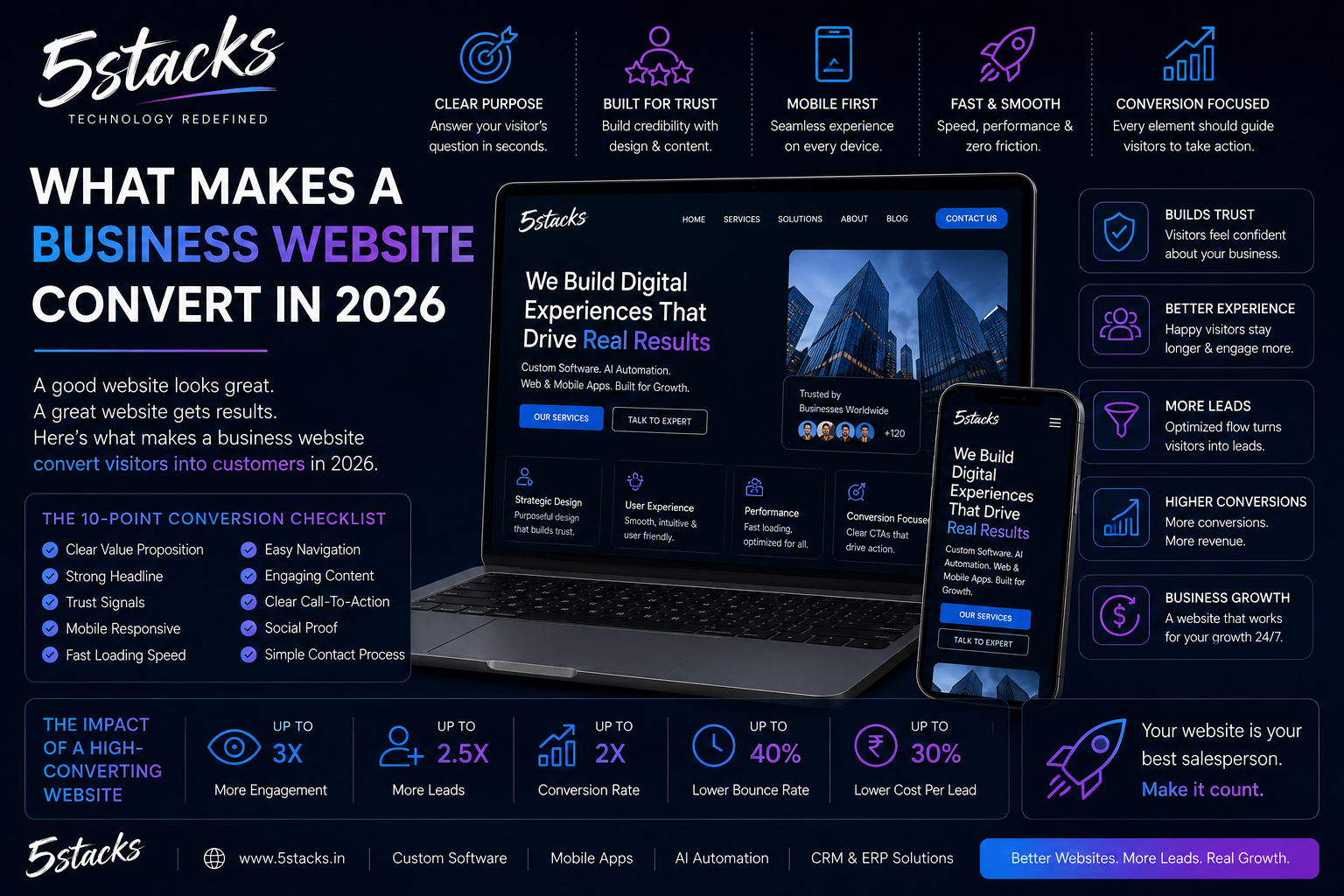
A business website has one primary job: turn visitors into conversations — calls, forms, WhatsApp chats, or booked meetings. Design matters. Brand matters. But in 2026, sites that look expensive and still get zero enquiries usually fail for the same reasons: unclear offer, weak proof, and confusing next steps.
This guide is for founders and marketing owners who want a site that sells without feeling salesy. It reflects how we approach web development for service and product companies in India.
Conversion is not only “buy now.” For most B2B and professional services, conversion looks like:
Decide your primary conversion path before you redesign. If every page asks for something different, visitors hesitate. One primary CTA, repeated consistently, outperforms five competing buttons.
Visual idea: Funnel — Visit → Understand offer → See proof → Contact. Label drop-off points: unclear headline, no proof, slow form.
| Block | Question it answers | If missing… |
|---|---|---|
| Offer clarity | What do you do, for whom, with what outcome? | Bounce in seconds |
| Relevance | Does this match my industry / problem? | “Not for us” exit |
| Proof | Have you done this before? | Silent distrust |
| Frictionless CTA | How do I start? | Interest without action |
| Speed & clarity | Is this easy on mobile? | Abandon before the pitch lands |
Your first viewport should state the brand, one headline, one supporting line, and one CTA group. Avoid stuffing the hero with stats rows, service grids, and popups. If a stranger cannot explain what you do after five seconds, rewrite the hero before touching colours.
Speak in the buyer’s language. “Digital transformation partner” is weaker than “Custom CRM and websites for growing manufacturers and service firms.” Segment pages when needed (industry or service), but do not create thin duplicate pages.
Proof is portfolio, process, reviews, logos, and specifics. “Trusted by 500+ clients” without evidence is noise. One detailed case study often beats ten logo tiles. See how we structure work on our portfolio.
Use action language tied to value: “Book a discovery call”, “Get a project estimate”, “Talk on WhatsApp”. Avoid vague “Submit”. Place CTA after proof, not only in the header.
Heavy animation, auto-playing sound, or multi-megabyte hero videos without purpose kill conversion on mid-range Android phones — still a large share of Indian traffic. Optimize images, defer non-critical scripts, and test on a real phone.
You do not need fifty pages. You need the right few, finished well.
| Page | Job | Must include |
|---|---|---|
| Home | Orient + route | Offer, top services, proof, CTA |
| Services | Depth | Outcomes, process, FAQs, CTA |
| Portfolio / case studies | Proof | Problem → solution → result |
| About | Trust | Who, where, how you work |
| Blog | Education + SEO | Guides that link back to services |
| Contact | Convert | Short form, phone, WhatsApp, map if relevant |
Each service page should stand alone for SEO and sales. A visitor from Google should not need the Home page to understand the offer.
GST details, registered address, and team photos help for many B2B deals. Do not fake testimonials. Empty review widgets hurt more than none.
Most enquiry abandonment happens on mobile forms. Keep fields minimal: name, phone/email, short message, and optional budget or service dropdown. Multi-step forms only help when you qualify high-ticket leads carefully.
Pair the form with a short “What happens next” note. Uncertainty kills conversions as often as bad design.
Many buyers compare three vendors before a call. They scan Home, open one service page, check portfolio, and glance at Contact — often on mobile between meetings. You have minutes, not a 30-minute pitch.
| Stage | What they look for | What kills trust |
|---|---|---|
| First 5 seconds | Clear offer + credible brand | Generic stock hero, vague headline |
| Next 2 minutes | Relevant proof + process | Empty portfolio, broken links |
| Before contact | Phone, city, response promise | Form-only ghost site |
Design for that scan path. Put proof where scepticism peaks — after claims, before the CTA.
Read copy aloud. If it could describe any agency, rewrite until it could only describe you.
Before Figma, write the words for Home and your top two service pages: who you help, what you deliver, how you differ without empty superlatives, and the next step you want. If an outsider cannot paraphrase your offer, design will not save conversion.
Share one messaging sheet across design, development, and ads. When channels contradict each other, trust drops.
After the hero, every block should earn rent: services snapshot (with outcomes), featured work (with context), how you work (specific steps), testimonials (real), blog teasers (useful), final CTA (with reassurance). Cut template filler — fake partner rows and unbelievable counters hurt Indian B2B buyers.
A strong service page includes outcome-led H1, who it is for / not for, deliverables, process, realistic timeline notes, proof, FAQs from sales objections, and a CTA with expectations. If you cannot publish packages, explain how scoping works — mystery pricing attracts tire-kickers.
Track form submits, call clicks, and WhatsApp clicks. Note landing pages in CRM. Change one major element at a time. Monthly, compare top exit pages with pages that produce enquiries — close the gap.
If your site looks fine but enquiries are flat, the fix is usually messaging and proof — not another colour tweak. Talk to 5Stacks if you want a conversion-focused rebuild or a critique of your current pages.
How many pages does a converting site need?
Should every page have a form?
Do animations help conversion?
WordPress or custom?
How long until a redesign improves leads?
Is WhatsApp okay as a CTA for B2B?
What should we measure first?